CASE STUDY: Creating branding and a design system from the ground up


Some context about the project
VoxSmart is a communications capture and surveillance platform that enables businesses to remain compliant and mitigate operational risk.
VoxSmart came to me to develop a branding and design system, and the relationship grew from there into consulting across user research and product design.
For the branding and design system I worked directly with the CEO Oliver Blower and CTO Noam Zeigerson.
Voxsmart had a "brand" but no existing brand system in place, so in a sense VoxSmart represented a clean slate. The key objective was to clearly articulate how the product would differentiate itself from competitors, while ensuring the brand and messaging were flexible enough to evolve alongside the platform.
As a startup, VoxSmart’s product had minimal design and a number of user experience pain points. This would require a comprehensive design overhaul. The technical architecture would be evolving at the same time so I made sure that I collaborated closely with the development team to create a design system that supported rapid iteration and efficient product development.
This was a collaborative project. My role covering consultancy, brand design, UX/UI design, and user research to support strategic and product decisions.
Direct involvement across:
- Discovery and strategy
- Brand development
- Design system architecture
- User research and insights
- Website design & development
- App design
Creating VoxSmart’s brand
For its branding VoxSmart had only an existing logo and no supporting brand assets. It had a "branded" website but none of it was cohesive with the platform itself. As with all branding projects I use a structured set of well-honed, tailored questions to engage key stakeholders and define the foundation of the brand.
Startups and their leadership teams frequently hold different perspectives on how the company should be positioned. My questioning process helps clarify the most important aspects of the business, creating alignment and enabling an informed discussion around the best strategic direction. This is especially valuable at the leadership level where their time is critical.
Colours
While planning the initial branding concepts I noticed VoxSmart’s existing logomark evoked the idea of a prism. A lightbulb came on at that moment because it was a perfect analogy for VoxSmart’s platform, which takes complex datasets and separates them into meaningful outputs… like a prism separating light into separate colours.
That concept became the foundation of the colour system, opening up a flexible and expressive palette of colours and gradients that could be applied consistently across the brand.
Another requirement was to retain the existing red from the original VoxSmart logo. All supporting colours were developed around this core hue, resulting in a warm tonal range that sits naturally alongside the greyscale palette and reinforces the brand red throughout.
Typography
Technology sat at the core of VoxSmart’s ethos. While “AI” is an overused term, it still represented a fundamental part of VoxSmart’s product and brand positioning. To reflect this, I selected Neue Machina for the headline typography.
Neue Machina is a contemporary geometric sans-serif with distinctive descenders and subtle typographic details. Its sharp edges, monospaced elements and technical character reinforce VoxSmart's technological aesthetic perfectly.
Legibility is my primary consideration for any digital product design, particularly for a product experienced across multiple screen sizes. I apply my long time defined set of rules when selecting body text typefaces, focusing on details that directly impact usability and accessibility. One example is how a typeface handles the terminal on a lowercase “l”. This will lower the options available, but ensures every remaining option is a genuinely strong choice.
Neulis Neue was chosen for its clean, hybrid geometric–humanist design and approachable feel. It met all my legibility requirements while pairing fantastically with Neue Machina, and offered a balanced transition between technical geometric shapes and subtle humanist elements.


Logo redesign
I redesigned the existing VoxSmart logo to align with the new brand system, improving design precision within the logomark and introducing typographic contrast between "Vox" and "Smart."
Imagery
All brand and marketing photography was kept monochrome, allowing the brand colours underneath to emerge exclusively from VoxSmart’s technology. This concept was tied to the earlier colour prism metaphor which was revealing the underlying information and transforming it into something clear and understandable.
Boldness was a consistent request during the brand discovery amongst all stakeholders. The high contrast relationship between monochrome imagery and vibrant colour reinforces this idea, while also translating effectively to the light and dark mode within the product.


Creating VoxSmart’s design system
Once the branding was approved, my focus shifted to the design system. Close collaboration with the development team was essential. One of the primary challenges prior to my involvement was UI inconsistency and limited communication between creative, marketing, and engineering teams.
With the new CTO and I both coming from an agile background, we helped introduce agile principles and workflows to the team, which were relatively new concepts within the early stage startup environment. For everyone involved this meant establishing shared processes, improving collaboration, and defining clear milestones as the first priority.
The second phase focused on implementation of the design system. Which meant building the design system in Figma using its component architecture to ensure consistency, enable rapid iteration and support efficient design & development workflows.
Grid system, spacing and breakpoints
I designed a flexible grid system to adapt seamlessly across responsive screen sizes, while fitting cleanly within VoxSmart’s existing navigation structure.
Given that consistency had been a key issue prior to my involvement, a breakpoint spacing system was also created and embedded across all Figma components to ensure visual and functional consistency for every screen size.


Shadows
Given the volume and density of information generated by VoxSmart, we restructured the platform around a more modal-driven interaction experience. This approach reduced visual complexity and helped users focus on individual tasks. Maintaining visual hierarchy was established by implementing this new elevation and shadow system.

Icons
I love making bespoke, pixel-perfect icons. There is something almost zen about making sure each icon works harmoniously within the broader design system.
All design components
I adopt the modular approach for all design components. This approach ensures flexibility and long term scalability. Design systems require a large number of elements, and it was essential that these components could combine easily and adapt as the platform evolves.
Given the pace of how technology changes, a well structured design system helps reduce future design and development effort which will save both time and money. For VoxSmart this included the creation of fully supported light and dark mode component libraries.


Implementing the design system & user research
Following completion of the design system, VoxSmart retained me to support the platform’s UI and UX design. Improving the product required more than simply replacing existing components. It needed a user-centred approach that considered how design decisions impacted real user workflows.
Working closely with stakeholders, we defined a clear plan for the platform and its supporting business model. I collaborated across all product areas alongside the relevant project managers, ensuring alignment and shared understanding throughout the process.
Wireframes
Wireframes were used to define initial structures and user flows. Targeted user research with existing customers helped identify pain points. These insights informed the creation of interactive Figma prototypes, which were used to gather feedback and iterate on the designs.
Personas
Future focused concepts were explored and tested in line with VoxSmart’s strategic direction. User personas were developed to evaluate proposed platform features and ensure they supported long-term product goals.


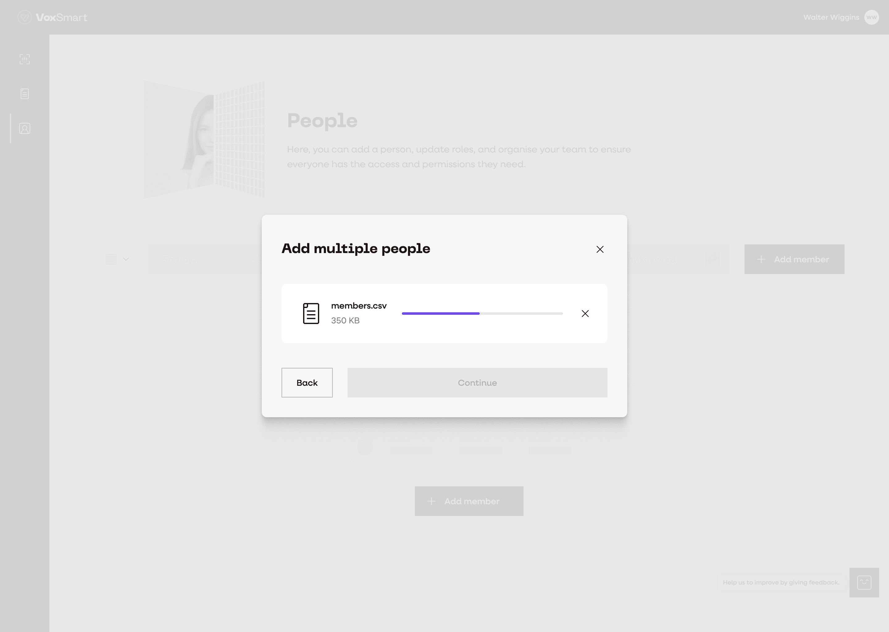
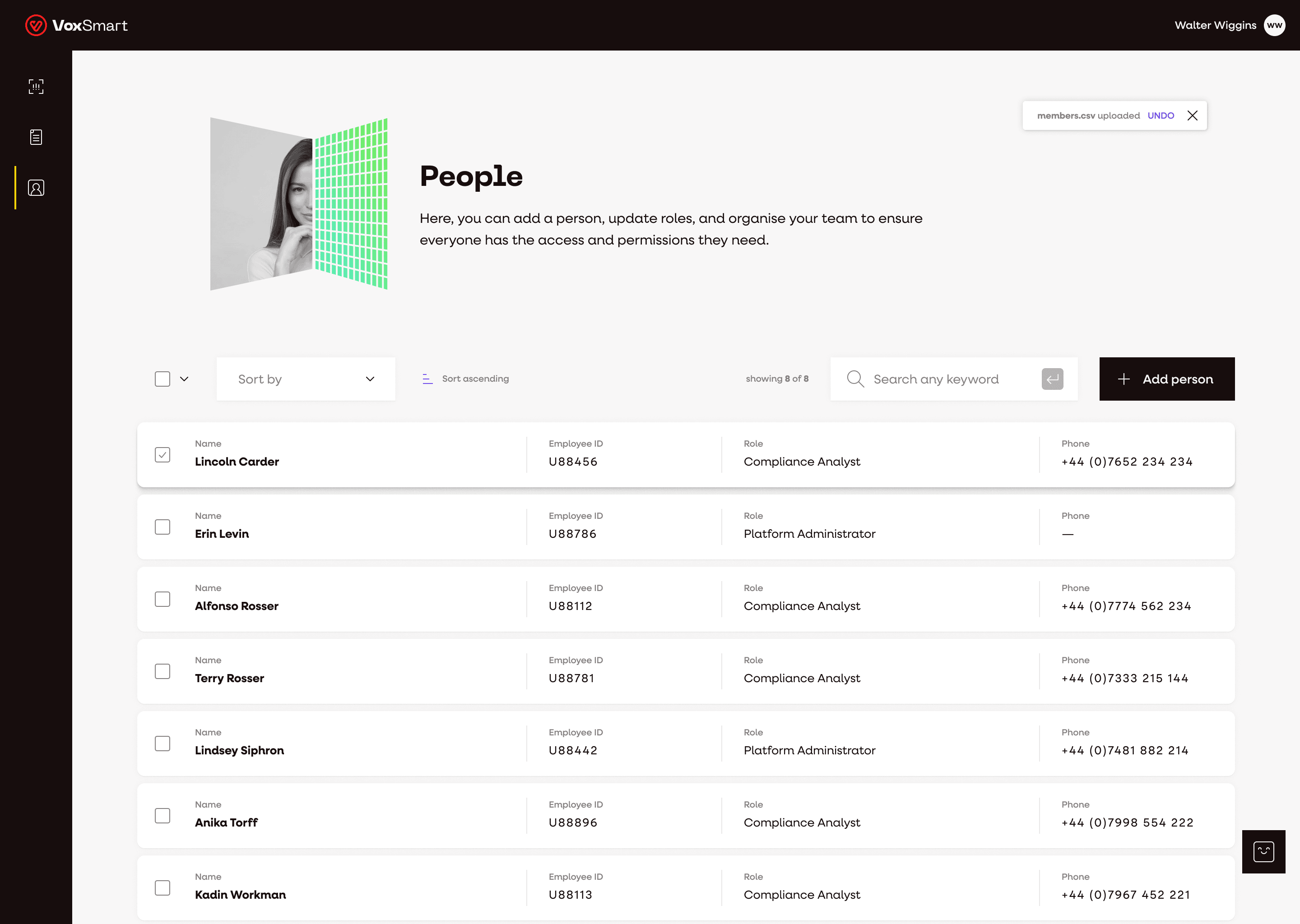
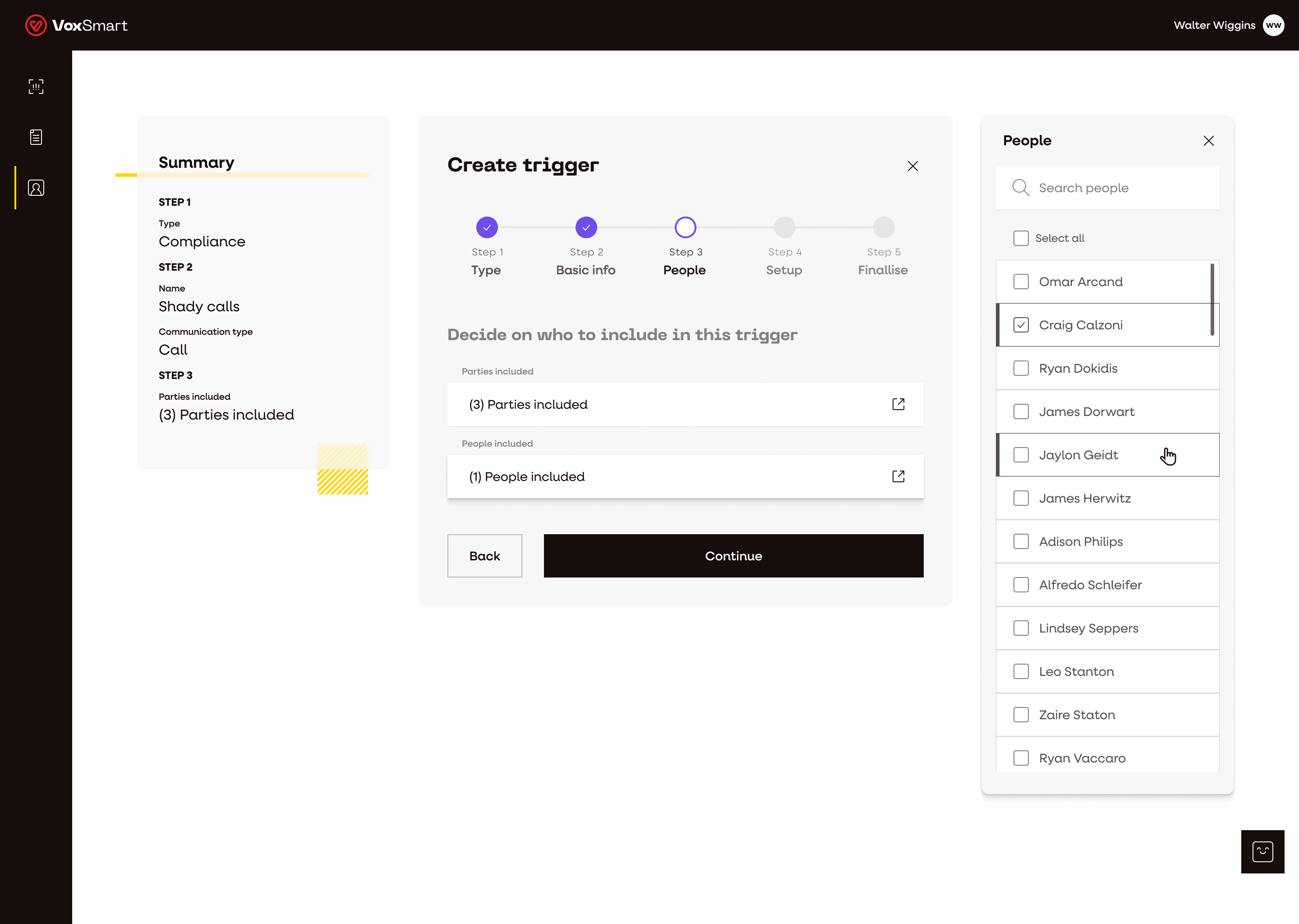
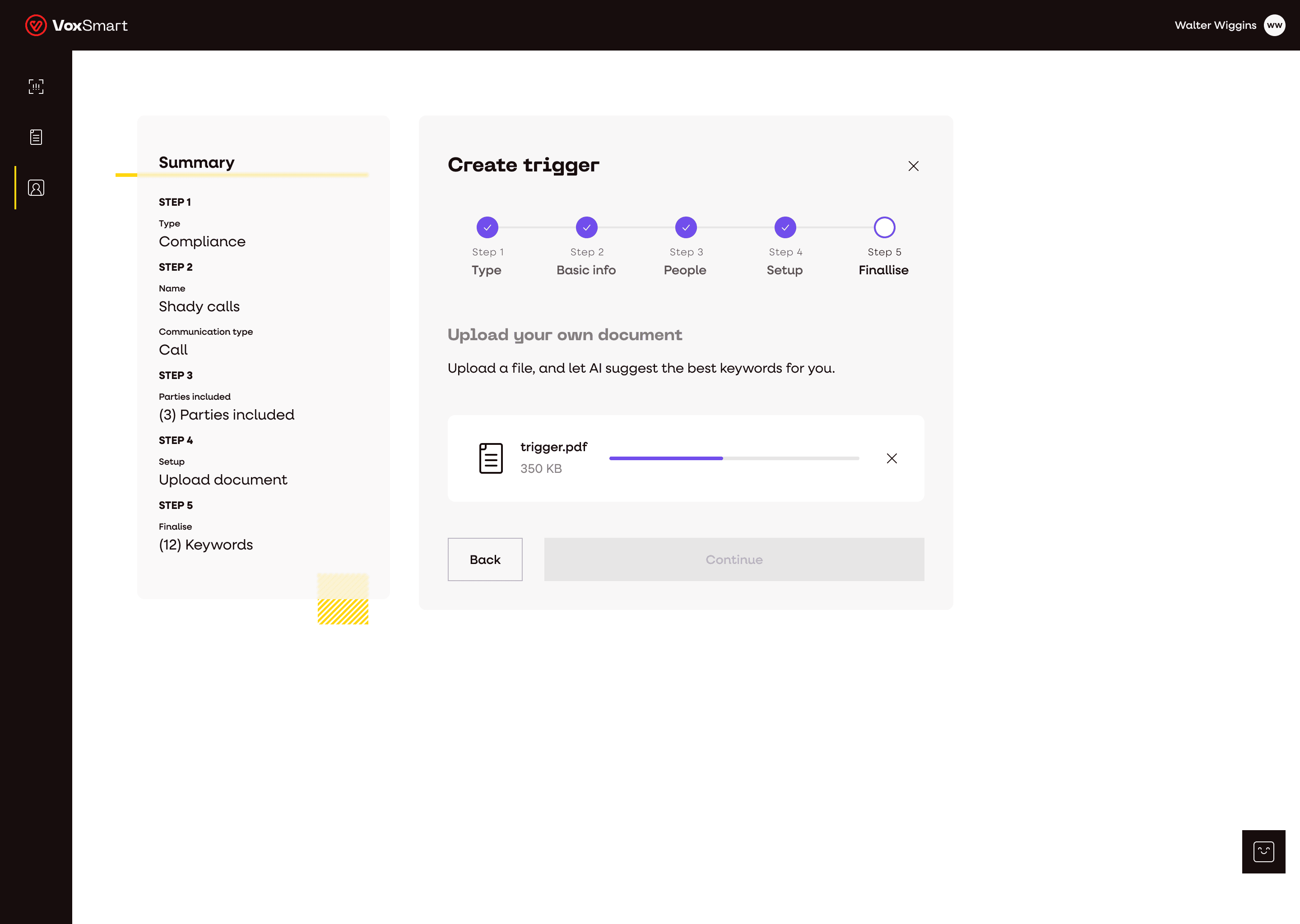
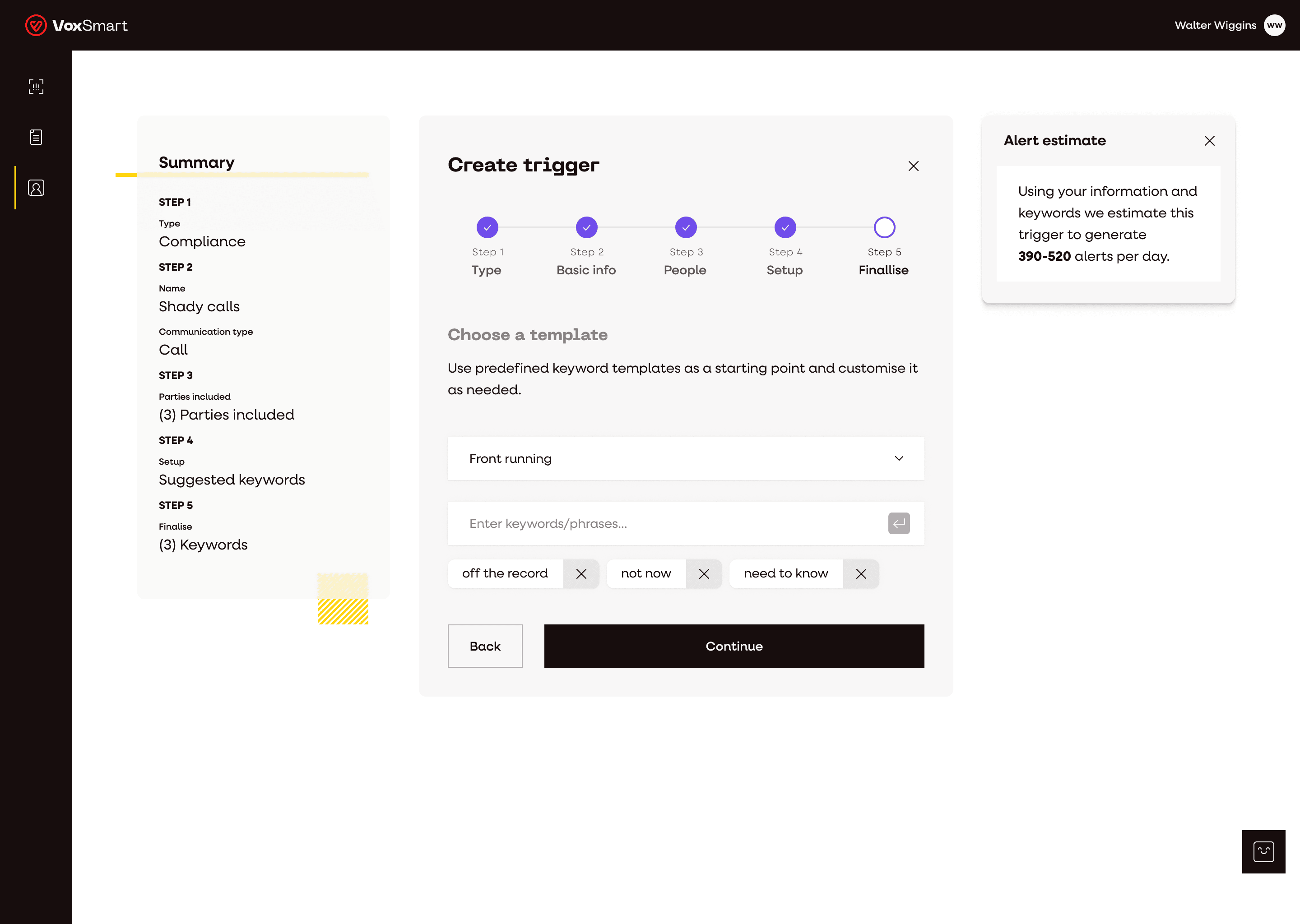
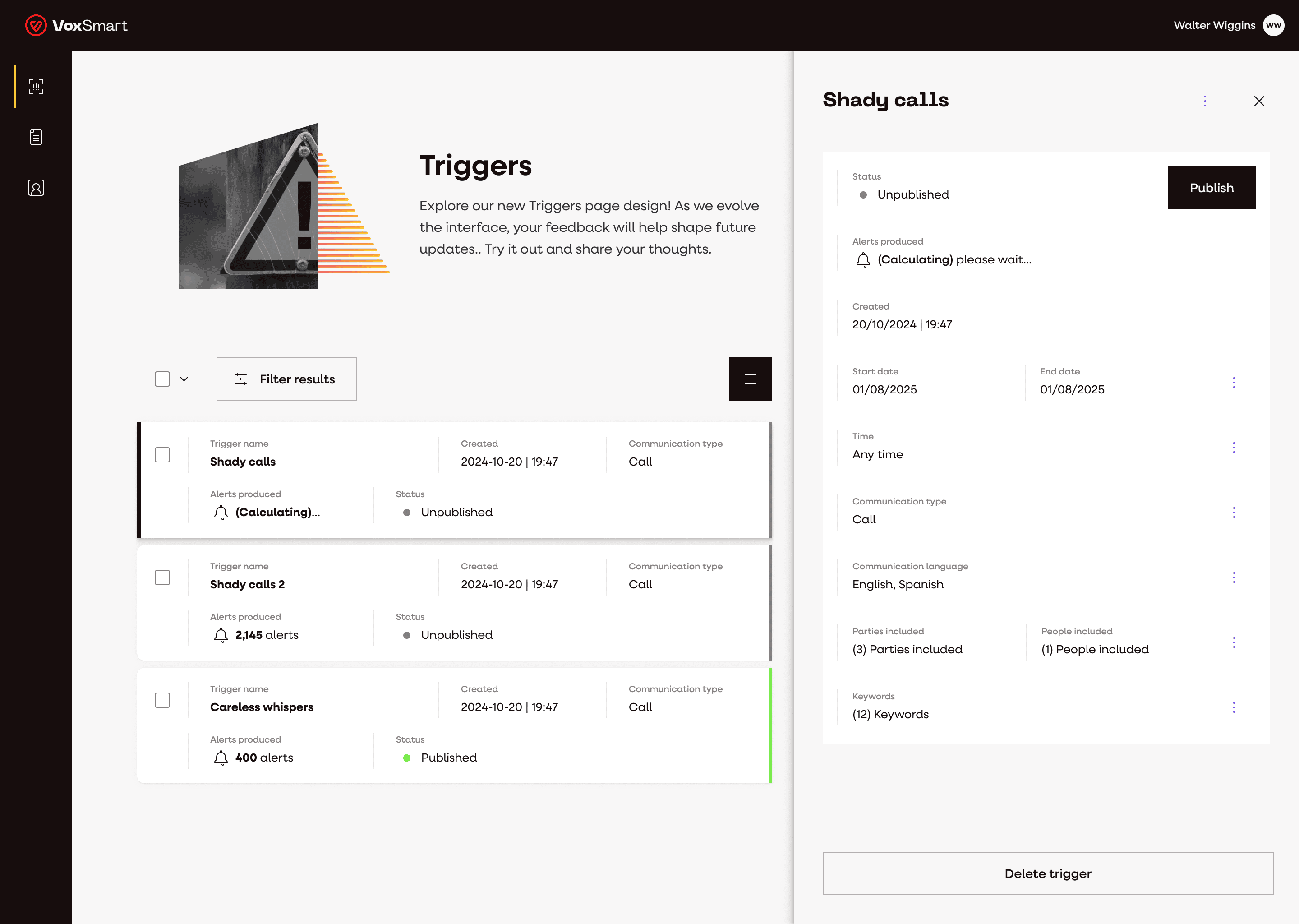
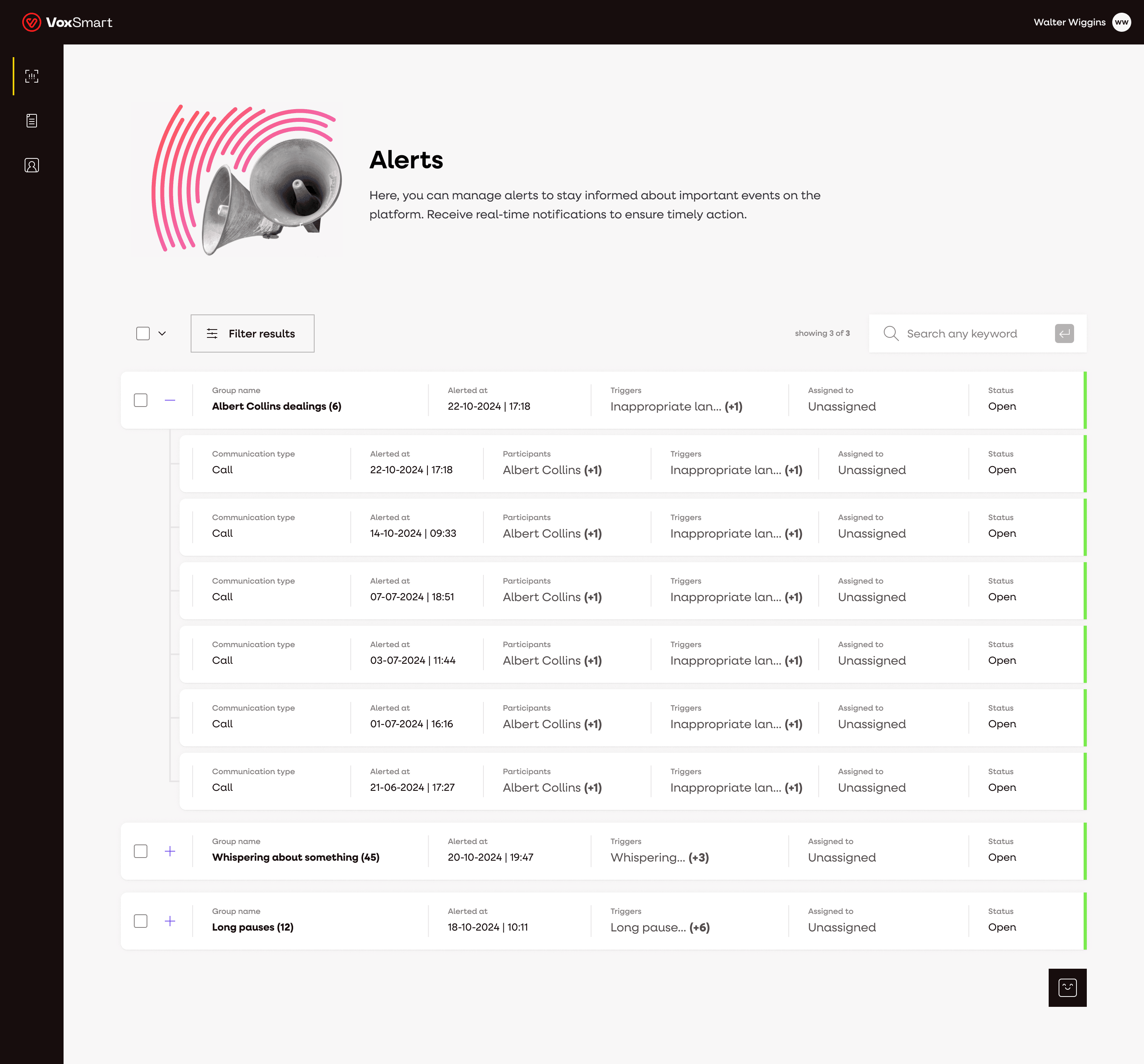
Platform design
Below are examples of the updated platform screens. The first screen shows the platform prior to the implementation of the design system which is a useful reference point for understanding the scope of the transformation.
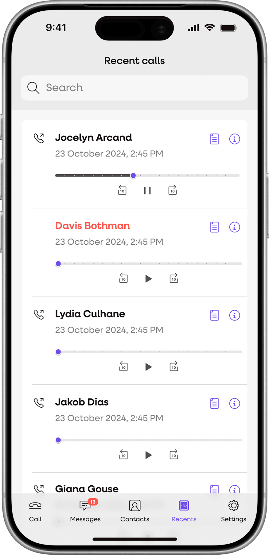
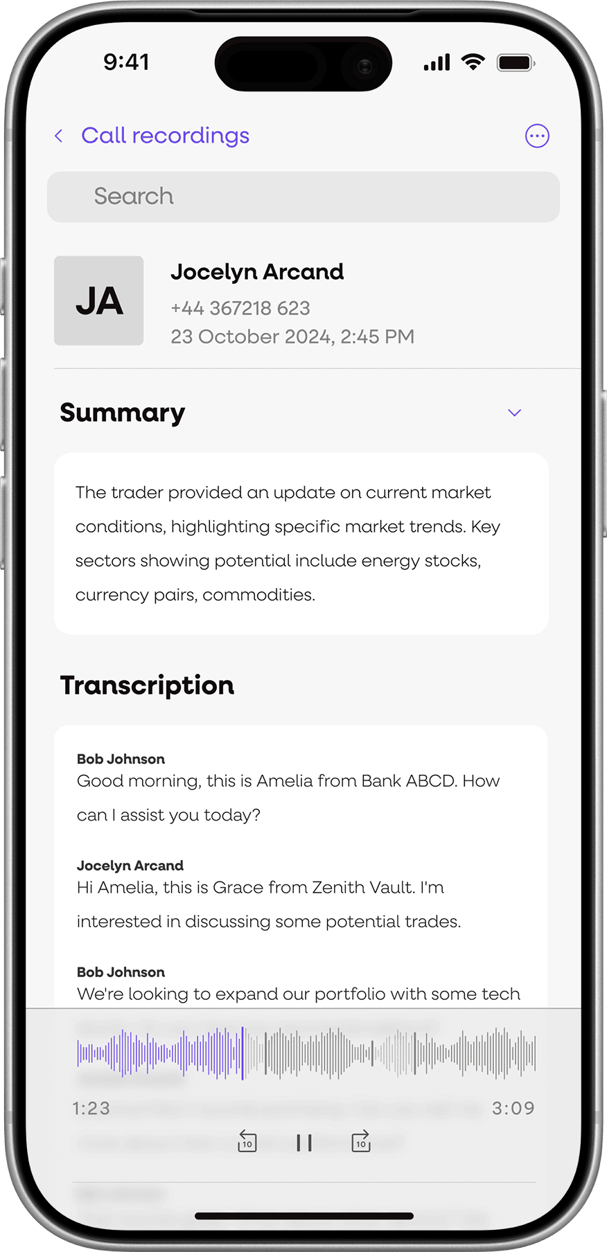
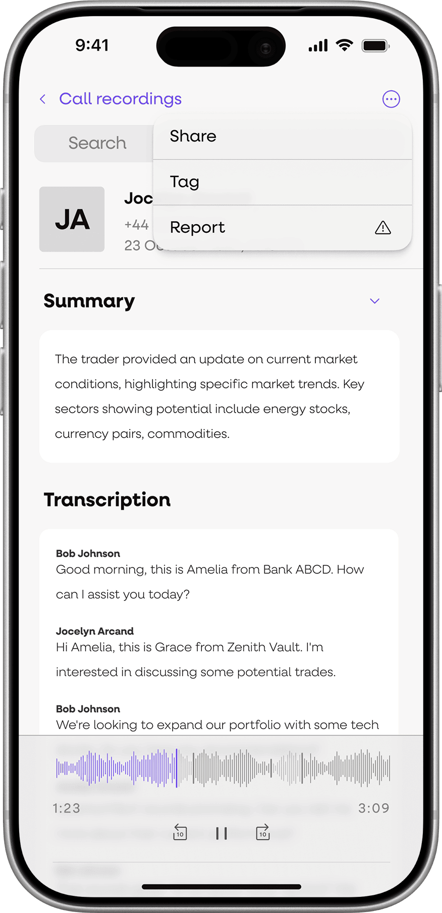
App MVP
I also designed the app’s MVP which was a streamlined and integrated platform for reviewing transcriptions and flagging compliance issues.
Launching & Testing the product
Maintaining the satisfaction of VoxSmart’s existing clients was a key priority throughout the project. Existing customers were closely involved through structured feedback, gathered in collaboration with the sales team and used to prioritise pain points and must have requirements.
The resulting platform represented a significant step forward in both capability and data capture. Although direct KPI comparison was limited by the previous platform’s lack of tracking, the overall impact was clear. Client feedback was overwhelmingly positive, and all planned business objectives and key results (OKRs) were met.
From a branding perspective, the work was enthusiastically received by the CEO and marketing team. It successfully captured the intended look and feel of VoxSmart. With a clear foundation and a complete set of marketing materials in place the company is now positioned to drive growth and increase brand awareness.